Apple launches Apple Store app in India

The Apple Store app provides customers with the most personalized way to shop for Apple’s innovative lineup of products and services. Learn more >

You can make a difference in the Apple Support Community!

When you sign up with your Apple Account, you can provide valuable feedback to other community members by upvoting helpful replies and User Tips.

Looks like no one’s replied in a while. To start the conversation again, simply ask a new question.

Numbers: switch bar colors from x-axis to y-axis

Hello,

When I create a chart from a Numbers table, Numbers seems to have some internal logic that assigns the coloring to a specific axis in my chart. When I transpose the table, the chart it creates then moves the color assignment to the other axis; in other words, it insists on coloring the same series.


Is it possible to switch the coloring to the other axis?


Thanks

Posted on Mar 22, 2023 8:31 AM

Reply
Question marked as Top-ranking reply

Posted on Mar 23, 2023 9:48 AM

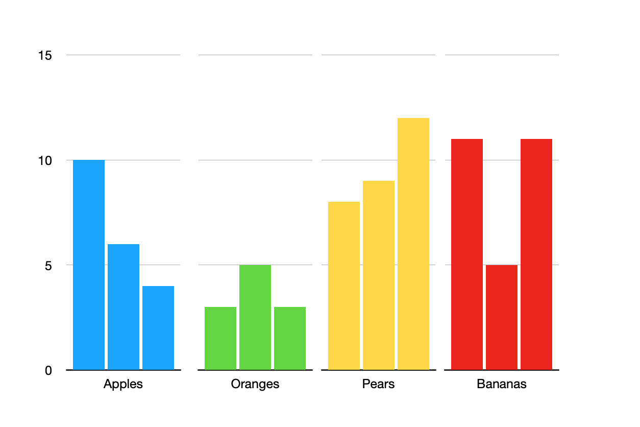
It won't change the chart. On a chart, each series is given a color. Your series are January, February, March, etc. not Apple, Orange, Pear. If you "edit data references" and change it so the fruits are the series, each will have its own color but then they will be spread across the chart. The apples won't be clustered together, nor will the pears or the other fruits. The first group will be January for each fruit, then February for each fruit, etc. The X axis will be the months. And the legend will be the fruits, not the months.


I was able to make the "chart" below but it takes some effort to make it and it will take additional effort to maintain it as you add more fruits and more months. It is actually four different charts, each plotting the data for a single fruit. Each bar in each chart is a month. I deleted the legends because all of the months in each chart are the same color so the legend was useless. I don't know what to suggest for a legend other than a text box of all the month names and a bunch of little squares positioned beside them with the chosen colors.


Here is what I did:

  1. I made the first chart for my row of apple data (I had only three months of data in the table). Make sure to set the Ymin and Ymax for the chart.
  2. Duplicated it 3 times (I had 4 fruits so need 4 tables)
  3. Removed the Y axis value labels from the three duplicates (select all the duplicates then make the change to all at the same time)
  4. Lined it all up.
  5. Edited data references for each chart to point to the correct row in my table
  6. Changed the bar colors for each chart (select all the bars in a chart and change them together).


If you add a new month to your table, you'll have to go into each chart and change the bar color for that new month. If you add a new fruit you'll have to duplicate one of the existing charts, edit the data references, and change the color of the bars.


For some changes, like if you need to change Ymin or Ymax later, you can select all of the charts and change them together vs one at a time.


6 replies
Question marked as Top-ranking reply

Mar 23, 2023 9:48 AM in response to sfkeydel

It won't change the chart. On a chart, each series is given a color. Your series are January, February, March, etc. not Apple, Orange, Pear. If you "edit data references" and change it so the fruits are the series, each will have its own color but then they will be spread across the chart. The apples won't be clustered together, nor will the pears or the other fruits. The first group will be January for each fruit, then February for each fruit, etc. The X axis will be the months. And the legend will be the fruits, not the months.


I was able to make the "chart" below but it takes some effort to make it and it will take additional effort to maintain it as you add more fruits and more months. It is actually four different charts, each plotting the data for a single fruit. Each bar in each chart is a month. I deleted the legends because all of the months in each chart are the same color so the legend was useless. I don't know what to suggest for a legend other than a text box of all the month names and a bunch of little squares positioned beside them with the chosen colors.


Here is what I did:

  1. I made the first chart for my row of apple data (I had only three months of data in the table). Make sure to set the Ymin and Ymax for the chart.
  2. Duplicated it 3 times (I had 4 fruits so need 4 tables)
  3. Removed the Y axis value labels from the three duplicates (select all the duplicates then make the change to all at the same time)
  4. Lined it all up.
  5. Edited data references for each chart to point to the correct row in my table
  6. Changed the bar colors for each chart (select all the bars in a chart and change them together).


If you add a new month to your table, you'll have to go into each chart and change the bar color for that new month. If you add a new fruit you'll have to duplicate one of the existing charts, edit the data references, and change the color of the bars.


For some changes, like if you need to change Ymin or Ymax later, you can select all of the charts and change them together vs one at a time.


Mar 23, 2023 12:19 PM in response to sfkeydel

Here's another take on it—one that doesn't provide the 'bar' display, but does apply the colours to the fruits, rather than the months:\


The chart type is an X-Y scatter chart, which treats both axes as Value data, and plots the points where the the x and y values cross.


The Dates listed in column A are Date and time values, set to the 15th of each month, and formatted to show only the name of the month.


Colours of the data dots are the ones automatically set by Numbers.


Regards,

Barry


Mar 23, 2023 1:53 AM in response to sfkeydel

I do not understand. The colors of the bars or lines in a chart are for each series, nothing to do with either axis. Numbers colors the first series blue, the second green, etc. Transposing a table (rows becoming columns) does not change the order of the series so the colors on the chart do not change when a table is transposed (please post a screenshot if you are experiencing otherwise). If you manually rearrange columns (or rows) in your table, which rearranges which series is first and second, etc. in the chart, then the colors on the bars/lines will change accordingly.


I do not know of a way to lock a color to a specific column/series if the columns are rearranged on the table but you can manually change the order of a series on the chart by selecting a series on the chart, going to the Series tab in the format sidebar, and choosing a desired "order" for it. It won't lock it in if you again change the order of the columns in the table but if you have formatted one series a special way at least you won't have to go through all that formatting stuff again, you can easily move it to the series you want.

Numbers: switch bar colors from x-axis to y-axis

Welcome to Apple Support Community
A forum where Apple customers help each other with their products. Get started with your Apple Account.