Apple launches Apple Store app in India

The Apple Store app provides customers with the most personalized way to shop for Apple’s innovative lineup of products and services. Learn more >

You can make a difference in the Apple Support Community!

When you sign up with your Apple Account, you can provide valuable feedback to other community members by upvoting helpful replies and User Tips.

Looks like no one’s replied in a while. To start the conversation again, simply ask a new question.

Keynote/numbers chart - Swapping x/y axis

Im trying to create this chart in keynote. However I cant seem to change a 2d bar chart to just display as symbols (dots for the data points) and if i use a line chart i cant just swap the axis so that the categories run up the y axis and the values run across the x axis. Any idea how to create this in numbers / keynote please?


Posted on Jun 2, 2023 6:12 AM

Reply
Question marked as Top-ranking reply

Posted on Jun 2, 2023 7:36 AM

Something like this?
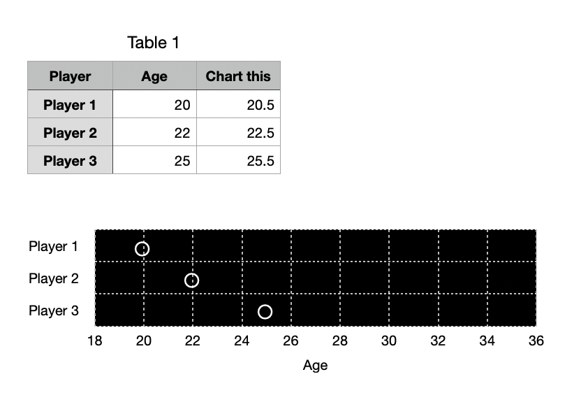


It's a little bit of a hack.


Add a column to your data table with slightly larger values than the actual ages. 0.5 worked here. Use 2d Stacked Bar and plot, giving you something like this.
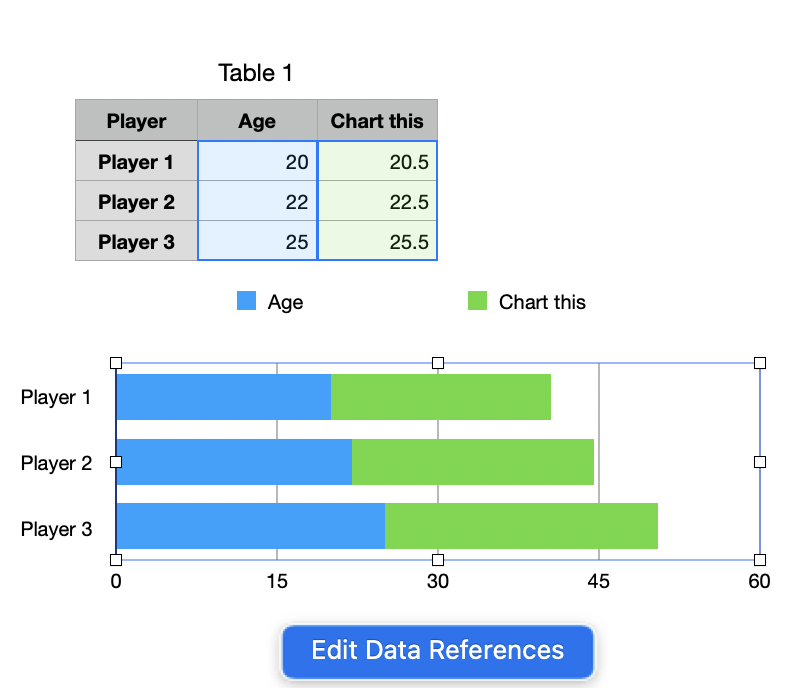


Click Edit Data References and delete the Age column from the references.


Click Create Custom Format under Value Labels:
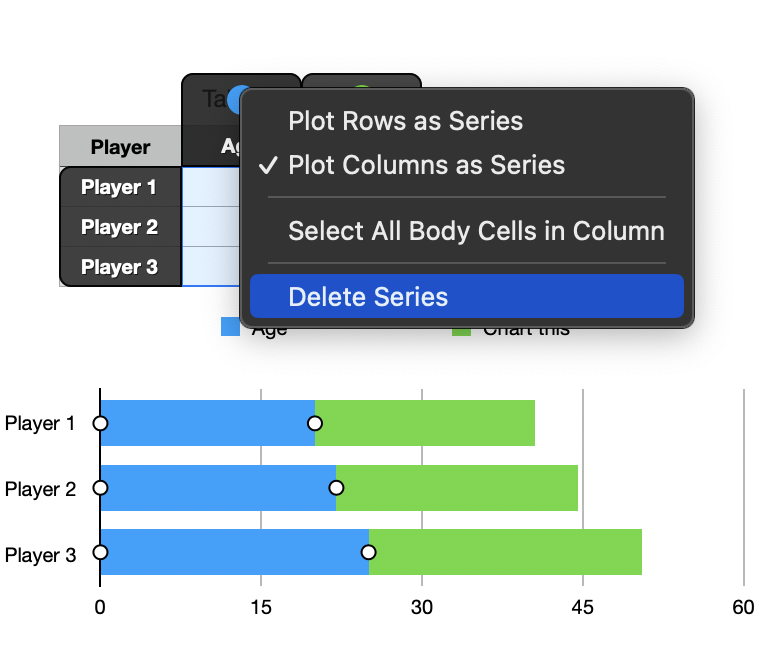


Create a rule something like this:


Or, even easier, just this seems to work:


I pasted in this for the circle character: ◦


You could use whatever other marker you want from Show Emoji and Symbols (under the input part of the Mac menu bar)


Click the series (bars) and in Style tab set Fill to No Fill.


Continue to format to taste, removing legend, varying the steps in the axes, etc., to get the scale in my top screenshot.


You may need to drag the chart slightly wider or narrower (and/or add leading spaces in the custom format) to get the circle markers to line up properly.


SG

7 replies
Question marked as Top-ranking reply

Jun 2, 2023 7:36 AM in response to chris_forest

Something like this?


It's a little bit of a hack.


Add a column to your data table with slightly larger values than the actual ages. 0.5 worked here. Use 2d Stacked Bar and plot, giving you something like this.


Click Edit Data References and delete the Age column from the references.


Click Create Custom Format under Value Labels:
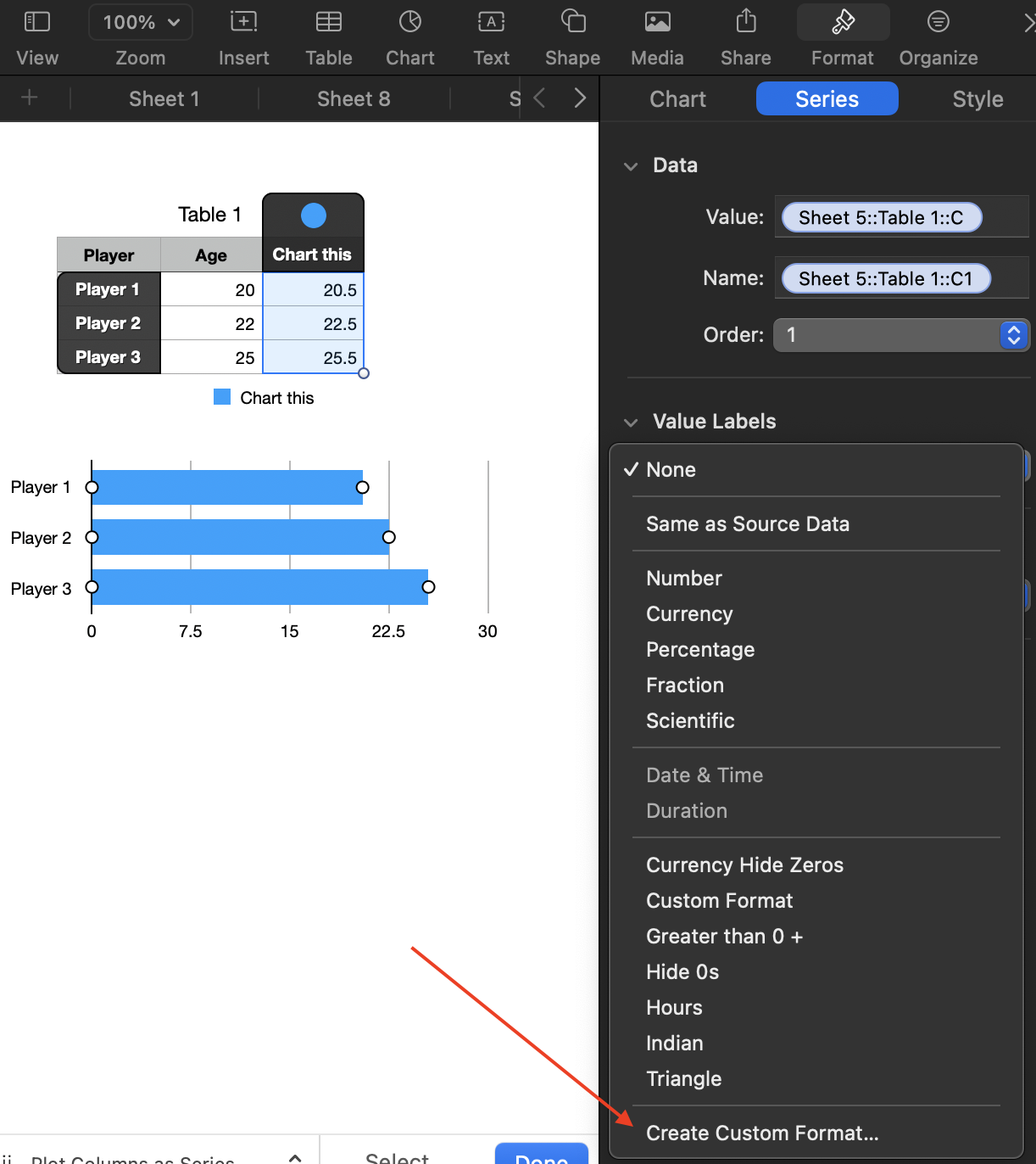


Create a rule something like this:
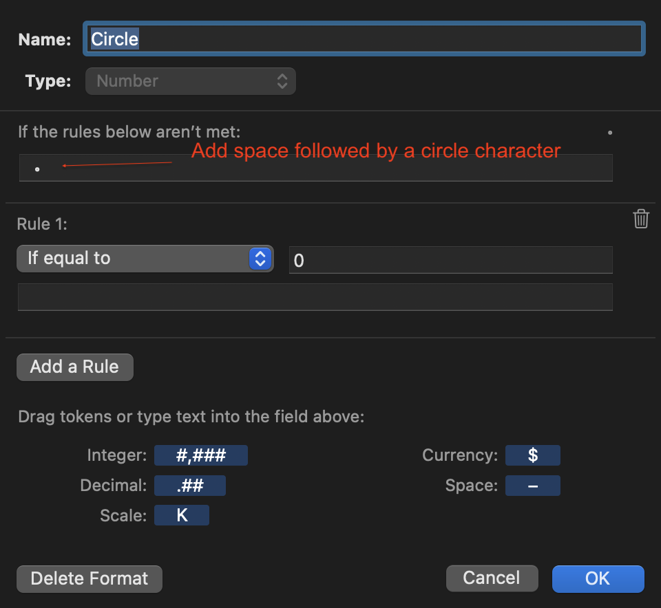


Or, even easier, just this seems to work:
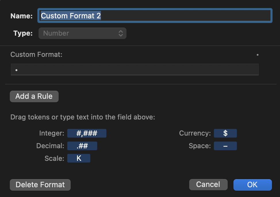


I pasted in this for the circle character: ◦


You could use whatever other marker you want from Show Emoji and Symbols (under the input part of the Mac menu bar)


Click the series (bars) and in Style tab set Fill to No Fill.


Continue to format to taste, removing legend, varying the steps in the axes, etc., to get the scale in my top screenshot.


You may need to drag the chart slightly wider or narrower (and/or add leading spaces in the custom format) to get the circle markers to line up properly.


SG

Keynote/numbers chart - Swapping x/y axis

Welcome to Apple Support Community
A forum where Apple customers help each other with their products. Get started with your Apple Account.