I experimented with the Scatter Chart sheet in the 'Charting Basics' template at File > New in the menu and got this (after shortening the data table name to 'Data'):
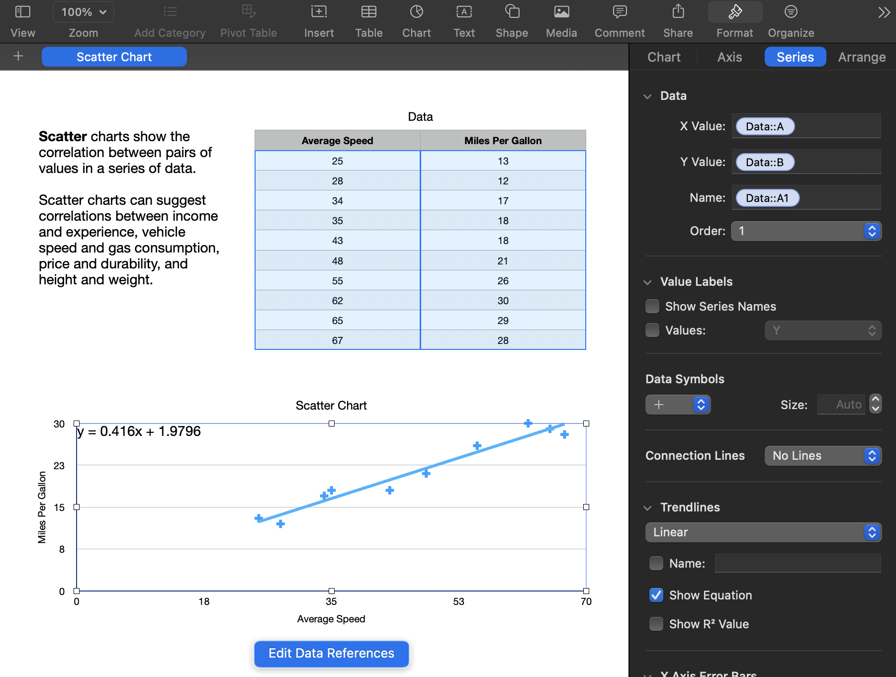
I was able to change the size and font of the displayed equation but couldn't change the number of displayed decimals or move the equation to another position.
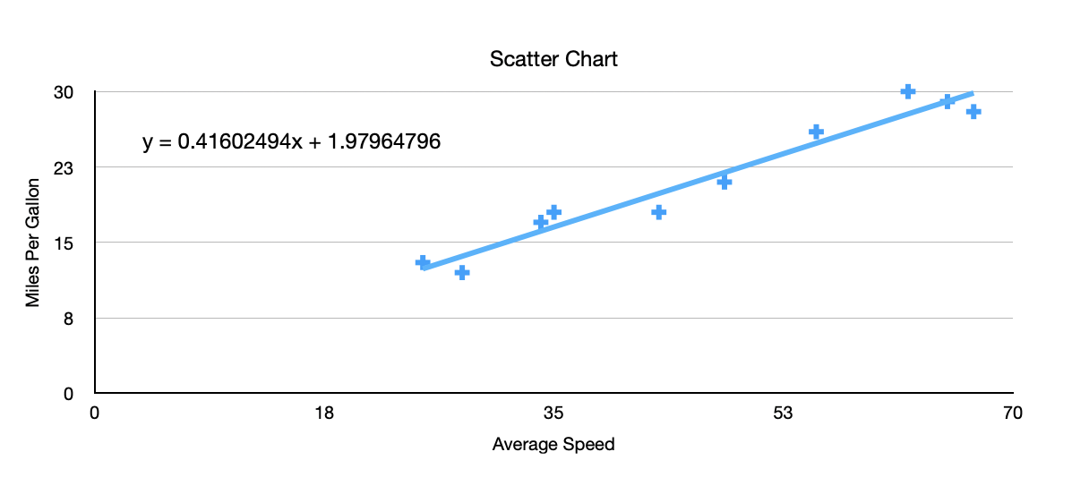
But by unchecking the Show Equation box and calculating the values in a table, removing the borders to the table, hiding columns, and drawing the table onto the chart, I was able to produce this:
The trick was to use the LINEST function that Ian suggested. I used it like this:
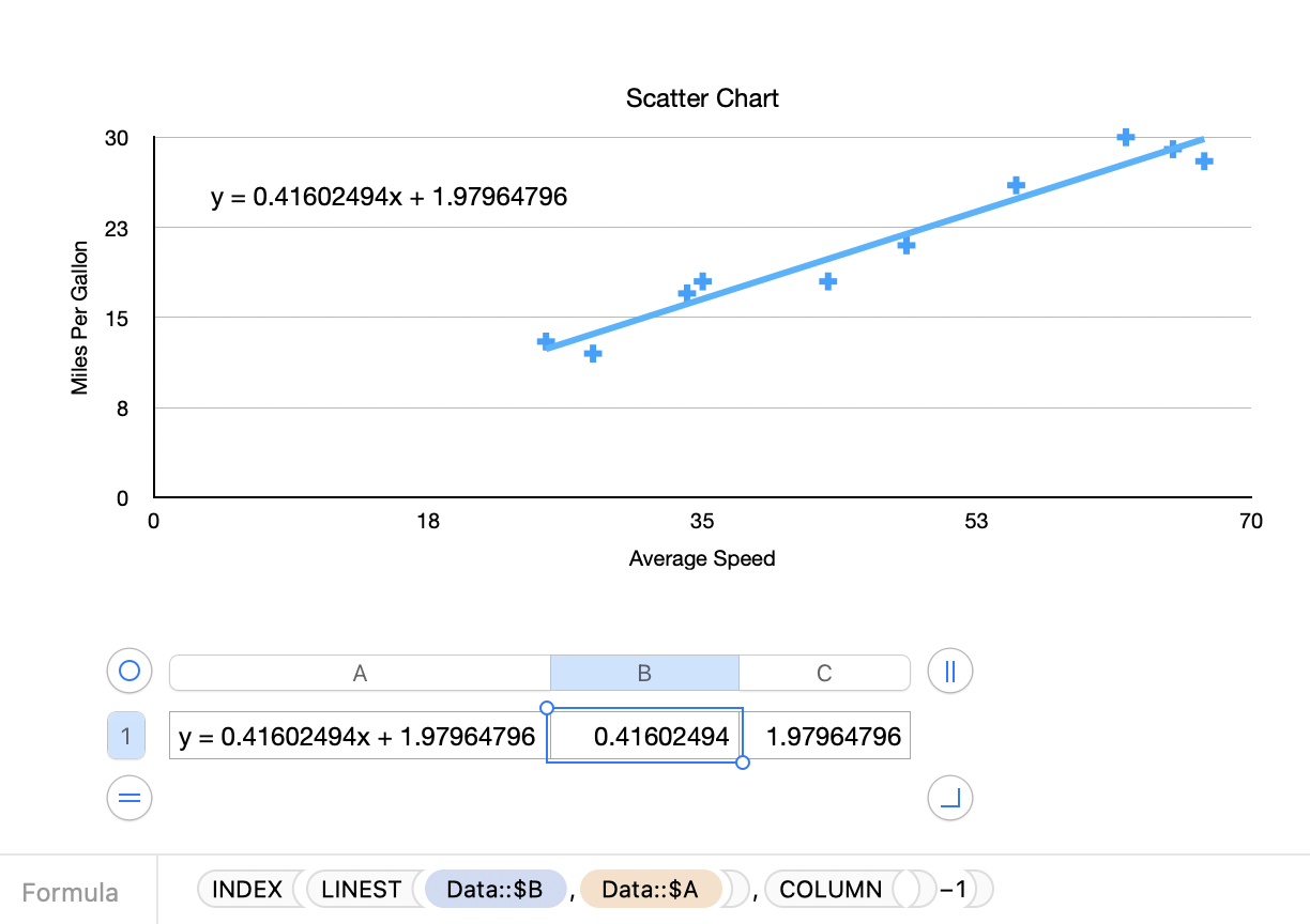
In B1, filled to right to C1:
=INDEX(LINEST(Data::$B,Data::$A),COLUMN()−1)
In A1, to concatenate the values for display on the chart:
="y = "&B1 & "x"&" + "&C1
I formatted the cells in B and C to the number of decimal places I wanted, hid columns B and C, turned off the table Title, and removed the border. Then I dragged the table onto the chart by clicking the concentric circles "bulls-eye" to its upper left.
This isn't too much work (now that I know what needs to be done!), but the automatically generated equation would actually be useful if it could be adjusted and positioned. You might want to consider leaving feedback with Apple at Numbers > Provide Numbers Feedback in the menu.
SG