This is doable, but quite complex - at least, it's not intuitive.
The main issue you face is that each series of data on the graph is shown in a single color - it is not possible, for example, to have a single data series change color based on positive or negative values.
Realizing that, you need a way to separate positive (gains) vs. negative (losses) into separate columns.
Here's one way I did it. I used several columns to make the steps clearer, but they could be combined into a single (more complex) function if you prefer:
First, my data:
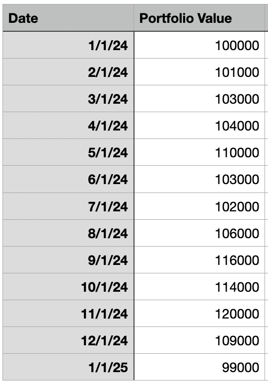
(yes, I used nice round numbers because I'm OCD)
First observation - there is no need to track 1/31/24 and 2/1/24 since the portfolio value can't change overnight - the value at the last minute of the last day of the month has to exactly match the first minute of the first day of the next month, therefore my data only tracks the 1st of each month.
First step is to calculate the profit/loss on a monthly basis. I did this by adding another column (C) that calculates the difference between the two preceding values in column B:
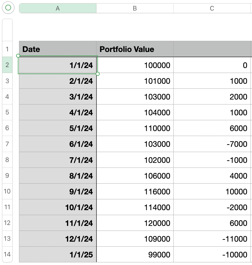
the formula for C2 is simply 0 (it's our starting point), but the formula for C3 calculates the difference between the portfolio value at the beginning of the previous month (B2) and the current month (B3):
=B3-B2
Fill this formula down the column and you have the profit/loss per month (you may already have this column).
Next step is to add two more columns - one for profits and the other for losses. This simply looks at the Difference column and filters out either positive or negative numbers, as appropriate.
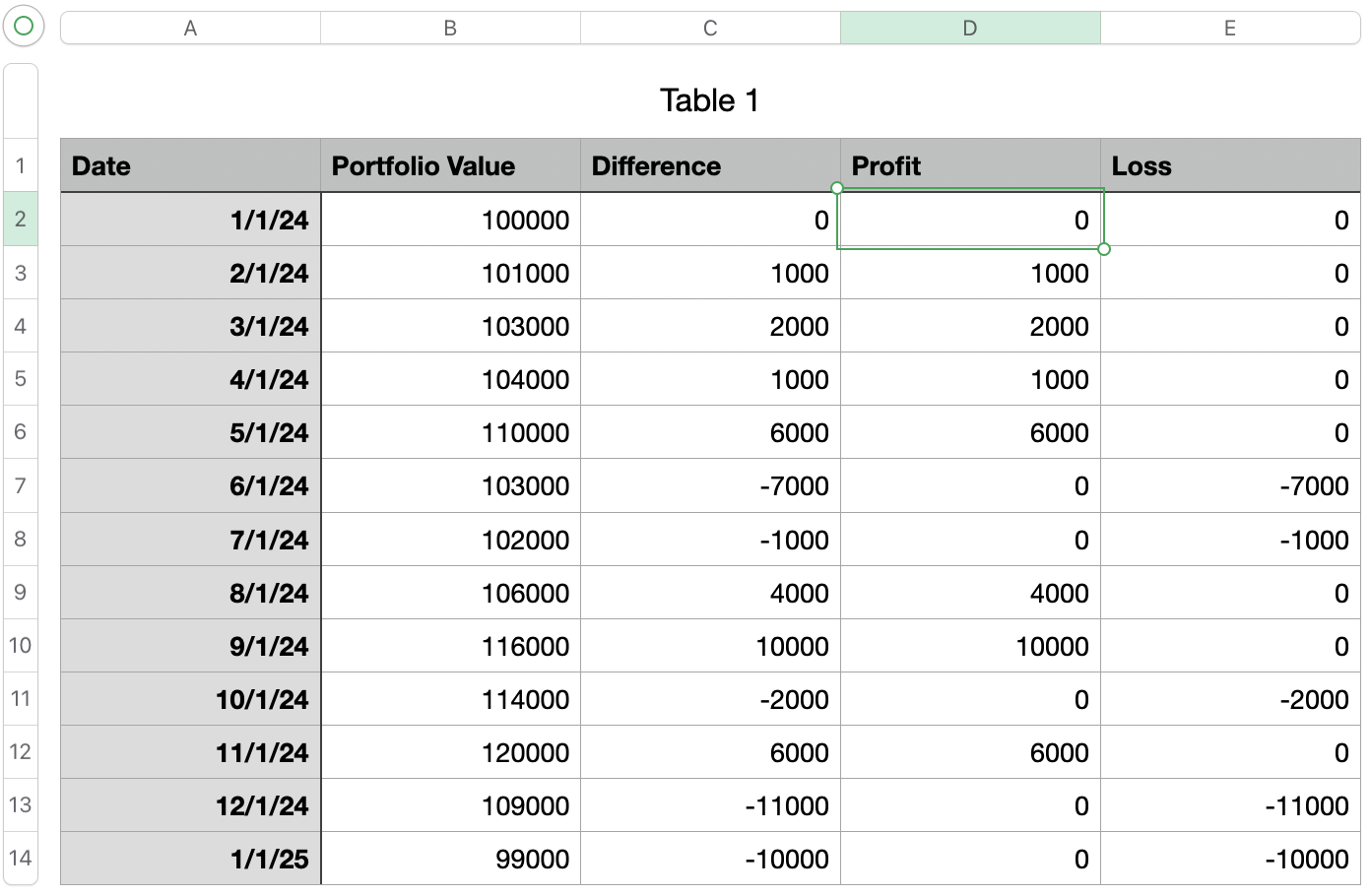
The formula for D2 is simply:
=MAX(C2,0)
This picks the highest value between C2 and 0 - since losses are negative, they get suppressed
Conversely, E2 is:
=MIN(C2,0)
which picks the lower value (profits are suppressed).
Now you have separate columns for profits and losses, and these are what you want to chart.
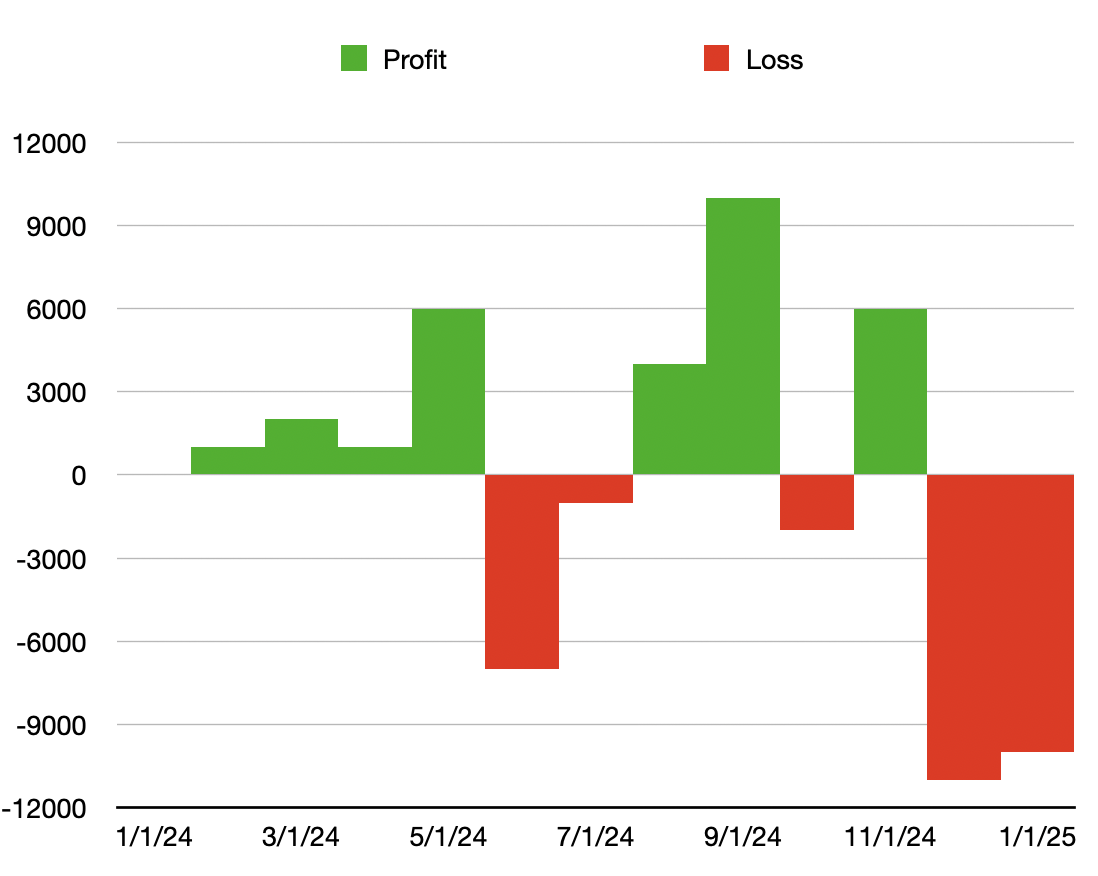
Select columns A (date), D (profit) and E (loss) and click Chart -> Stacked Column. You should see something like:
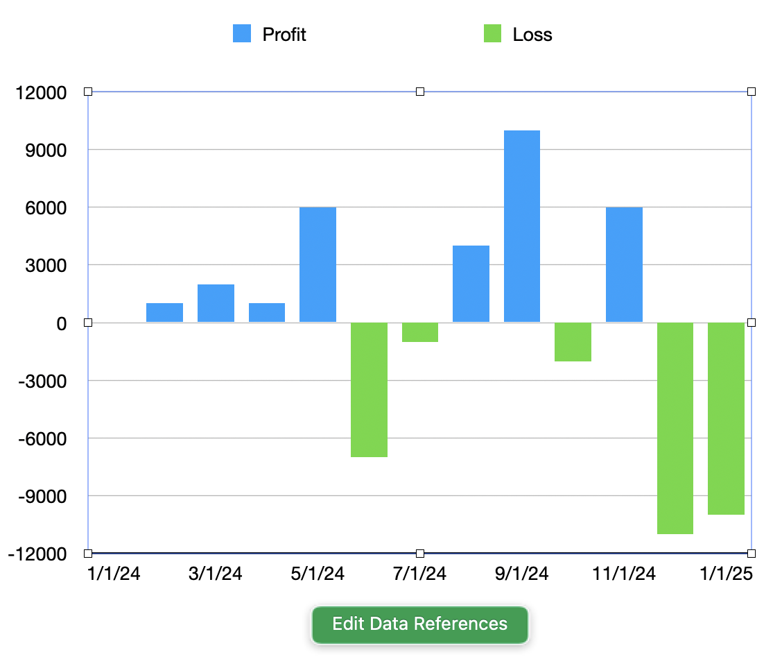
Here you can see the profits in blue, and the losses in green. With a little tweaking of the colors and the layout you can get your colors of choice: