First recommendation: don't do this in a spreadsheet. Seriously. Project management, Gantt charts, dependencies and the like are best handled by a project management software package that understands these things, rather than being bolted on to a spreadsheet.
That said, if you're insistent on a spreadsheet, the underlying problem with your above graph is that you cannot mix DATE and DURATION values on the same axis.
Conceptually, each bar represents the duration of each category, with dates marking the start and end points, so that's what you have to put on your charts - either use all dates, or all durations, but not a mix
If you want durations, I recreated your table, adding an additional column for the 'delay' between the project start date and this item's start, in the form:
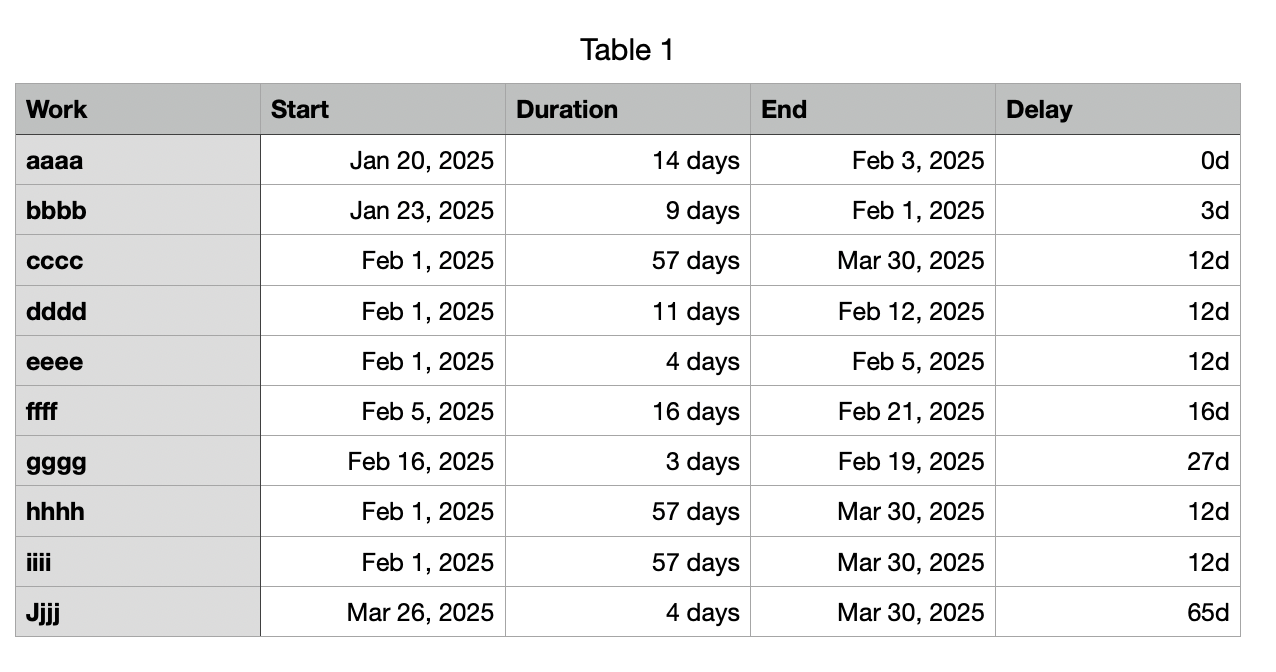
where the formula for E2 is :
=B2−MIN(B,B2)
(fill down)
This calculates the difference between the first (lowest) date in column B and the start date for this row.
Now I have two Duration columns that can be charted together.
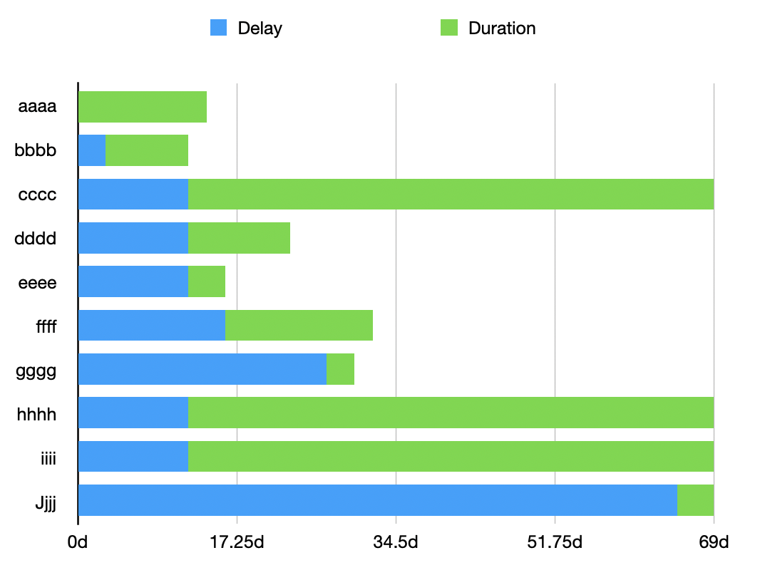
Select Stacked Bar from the Chart menu to create a new (blank) chart.
Select the chart, then click Add Chart Data to define the data to display
FIRST click the new Delay column, then click the Duration column:
You should see something like:
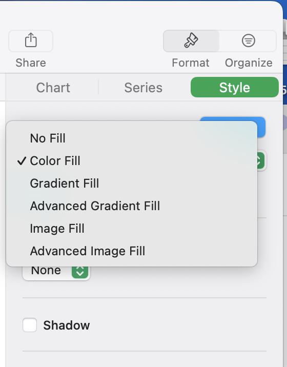
A little formatting, such as selecting the (blue) Delay series -> Format -> Style and setting the Fill to None gives you something closer to what you're looking for:
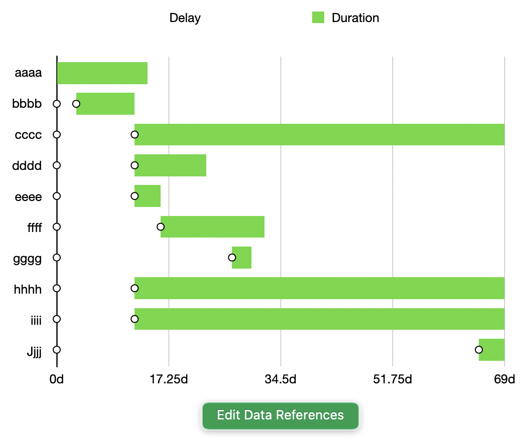
There are still some issues, such as the axis labels indicating durations rather than actual dates (although you can set mins and maxes here), but these are the kinds of things that a project management application would take care of automatically.

If you don't want the duration-based chart, you can get something similar with charting the Start Date and End Date columns using the same technique. The problem here, though, is that you can't control the start date of the chart (which may be a bug), and I couldn't quite find the right offsets to make the chart work (hence my bias towards a project management app)