Marino Pascal wrote:
Now if I wanted a monthly chart?
Pivot Tables are particularly good at aggregating data by month. They do so automatically. (You can also click the circled i for other periods. And summarize by Average, Maximum, Minimum, etc instead of Sum.)
Click in the table with the data, choose Organize > Create Pivot Table > On Current Sheet from the menu, and in the Pivot Options pane that appears drag the fields down into the relevant boxes below as shown.
Then you select the cells in the Pivot Table and insert a chart.
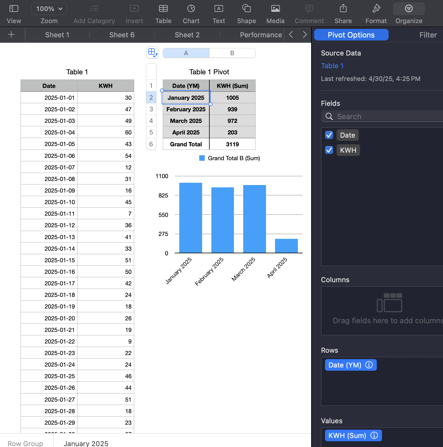
I you don't like the way the Pivot Table looks you can copy-paste its cells into a "regular" table, format that, and b base the chart on that table.
Pivot Tables are fast. This took me less than a minute to set up. Much quicker than entering and debugging formulas with SUMIF, although you can do it the "old school" hard way with those instead if you want.
Intro to pivot tables in Numbers on Mac - Apple Support
The basic idea of all approaches is to first aggregate your data by month in a table, and base your chart on that table.
SG